Google Weather app
Google · UI + UX design · Icon design
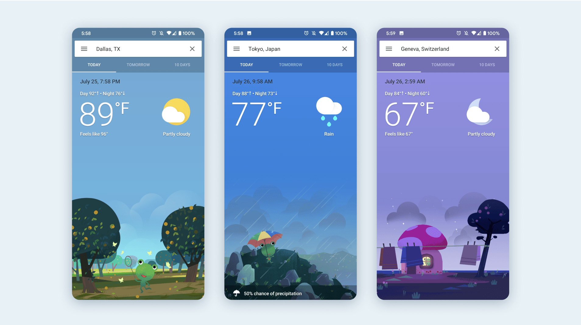
Google's Weather app on Android devices features everything you'd expect from a weather experience with the added delighful element of a Weather Frog.
I worked on the visual design of this app which includes the color system for sky conditions, a whole new set of weather icons for Google, and the system for incorporating weather frog illustrations into the experience.
I worked on the visual design of this app which includes the color system for sky conditions, a whole new set of weather icons for Google, and the system for incorporating weather frog illustrations into the experience.


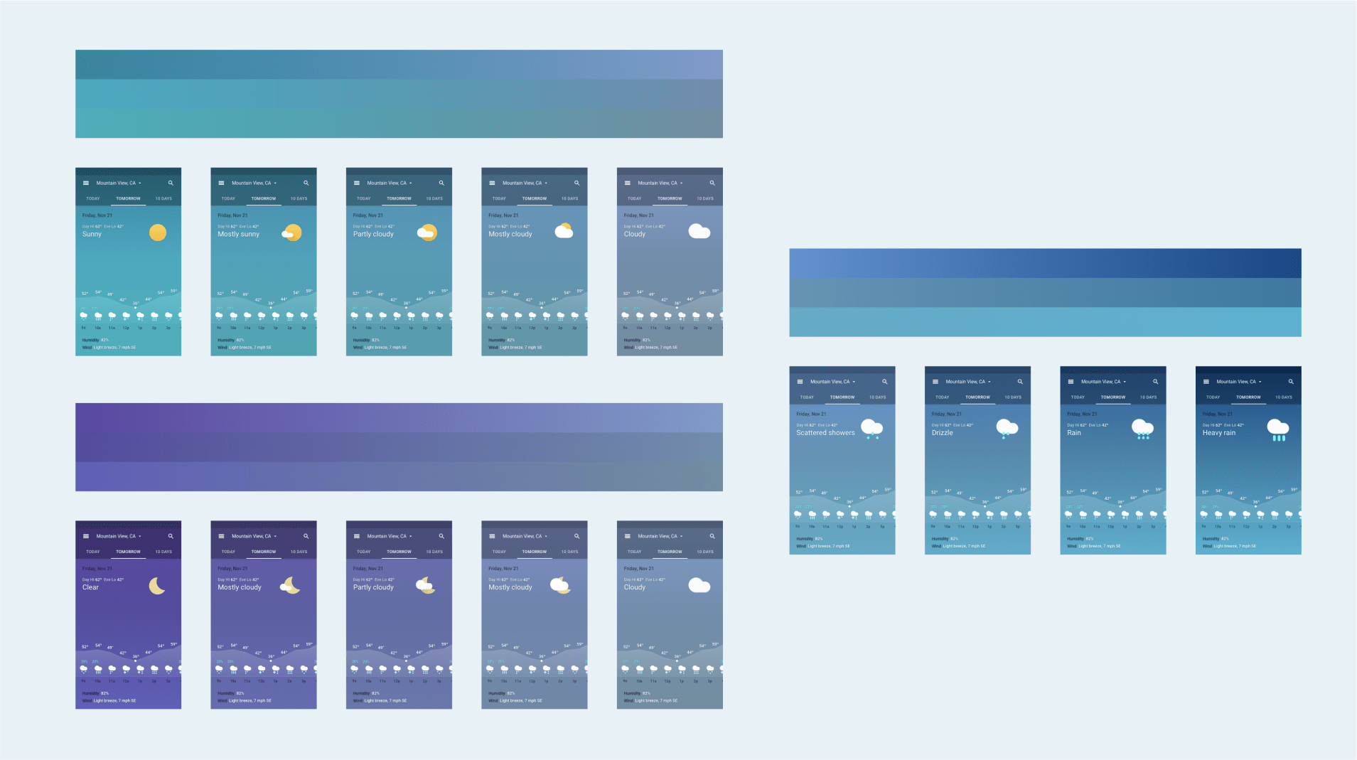
Each sky condition is assigned a set of colors for the header UI and app background. The color system is based off a gradation between severity of sky conditions.

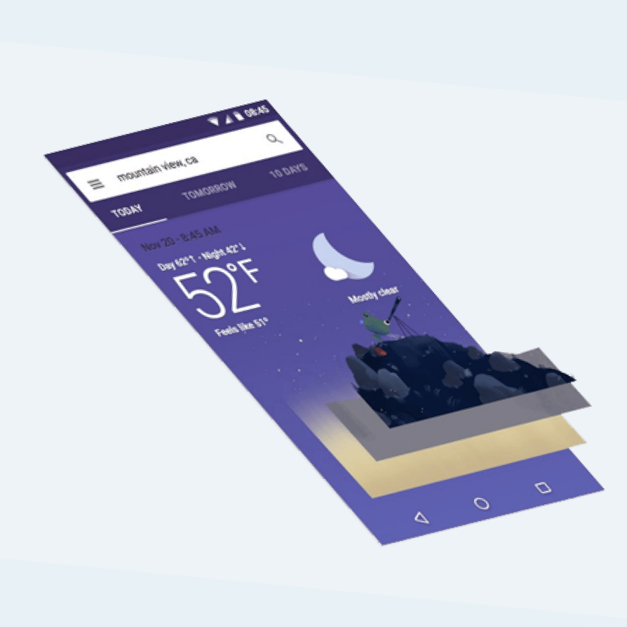
The illustrations assets are layered so they can transition onto the screen with some parallax. The layered system also allows us to reuse some common assets (like cloudy backgrounds), saving on filesizes and resources.
